Monday, December 10, 2012

United States of Moochers: Red vs Blue states

It's been a long campaign season, so I'm sure the first thing everyone wants to see is some extensive, in-depth political research! Some of you might remember an interesting figure that went around the internet a few years back. It sorts all US states into two columns, net contributors to the federal government vs. net takers; and two colors, red for republican and blue for democrat states. The conclusion is stark: republican states take more than they give to the federal budget, and democratic states give more than they take. But I thought the binary decision for each state (red or blue, giver or taker) was a bit simplistic, and it seems like it used just one snapshot of America (2004), so I did my own research. I gathered as much data as I could on the subject (sources were Wikipedia and the TaxFoundation.org). First, the normalized vote margins in the last 5 presidential elections (separated into colors at margin values of +/- 4% and +/-15%). Then the amount of money the federal government spends on each state, divided by the amount that state contributes, for the years 1981-2005, to get our "Mooching Factor".
Let red states secede if they want - that would solve our budget deficit instantly!
These results are also shown on this US map, where "Giver" states are given their normal red, blue, or purple, while the "Moocher" states are assigned the less-dignified colors of pink, cyan, and yellow.
You can clearly see that only 3/25 red states are givers (12%), while 11/16 blue states are givers (69%).  In fact, seven red states are bigger moochers than the worst blue state. But they say correlation (in this case 0.2, which is pretty weak) does not indicate causation. My first thought is that relative poverty rates in each state will be a determining factor. A state with richer people contributes more in taxes but takes less for social programs, right?
This explains part of the overall trend: red states tend to have higher poverty rates than blue states, so naturally they would be taking more money for social benefits while contributing less from taxes. But we see that all 10/10 (a shameful 100%) of "rich" red states still take more than they give, while only 4/13 (17%) of "rich" blue states do. Depressingly, poverty is less an indicator of whether a state is a giver or taker (0.12 correlation) than political lean (0.20). In the background you can see an aggregated "Redland" and "Blueland" (I didn't worry about "Purpleland"). We see that red states are significantly more impoverished, even though they have been receiving a "stimulus package" from blue states for at least 30 years running. But also interesting are the trends within Redland, where poorer red states don't necessarily take more than richer red states (the same is true for Blueland). It really looks like red states, not poor states, are inherently takers.

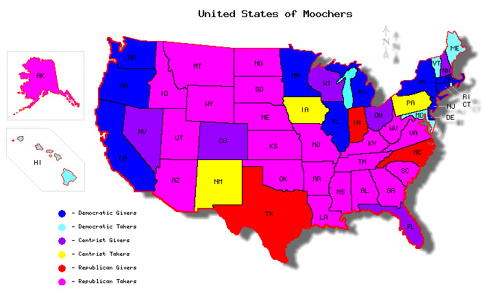
Another hypothesis is that each representative for a state is like a pig at the Federal Trough, grabbing as much money for their constituents as every other pig. That means that less-populous states, which have the same number of senators as big states, will have more congressional influence per capita, and therefore more federal money. I define "congressional influence" as the fraction of the House of Representatives that a state controls plus the fraction of the Senate that each state controls (this assumes both chambers of Congress are equal in budgetary power). In the plot below you can compare a state's congressional influence to its population by comparing the areas of the outer and inner circle; we see that for example, citizens of Wyoming have more than 10 times the congressional influence per capita as citizens of California.
It's evident that congressional influence is a large factor. Notably, each of the five most underrepresented states, regardless of political lean, all give more than they contribute. Over-represented red states are more likely to take more (all 18/18), while over-represented blue states are split evenly between givers and takers (5/10). This plot is perhaps the most damning of all for Republicans: it suggests that the only reason that any red states contribute more than they take is just because they don't have the congressional influence to grab more money from the Federal Trough, while blue states exercise fiscal restraint, even when they have the congressional influence to grab more money. Again, the implications are clear: Republican politicians greedily rake in as much money as they can for their states, while Democratic politicians govern toward some other goal, perhaps "the best interest of the country"? In the background of the figure we again see "Redland" and "Blueland", where Blueland has more people but less congressional influence, and therefore pays tribute every year to Redland. In fact, each citizen of Redland has 26.4% more congressional influence than a citizen of Blueland, which corresponds quite closely to their 26.4% higher Mooch Factor.

Red States Blue States
total moochers 88% (22/25) 31% (5/16)
fraction of poor states that are moochers86% (12/14)0% (0/2)
fraction of rich states that are moochers100% (10/10)31% (4/13)
fraction of under-represented states that are moochers 57% (4/7) 0% (0/6)
fraction of over-represented states that are moochers 100% (18/18) 50% (5/10)
Federal money spent/contributed ("Mooch Factor") 1.16 0.91
poverty rate 14.3% 11.7%
US population fraction 39% 41%
fraction of congress ("congressional influence") 44% 37%

Aren't Republicans supposed to be fiscally-responsible small-government advocates? If blue states are taking less but still have lower poverty for 30 years now, perhaps their governing model is more successful: social services to people in need, rather than trickle-down Reaganomics for the wealthy.

Thursday, August 16, 2012

Too lazy to "Occupy"? Hit the ATM.


When the "Occupy" movement first started, I felt like there were some legitimate claims buried in somewhat incoherent message. To me, the most compelling complaint is related to the increasing separation of wealth, how "the rich get richer". For example, since Reagan took office, the increase in after-tax income has leapt significantly for the richest Americans (much of which can be explained by Reagan slashing taxes for the richest Americans), while rising only modestly for the bottom 80%.


Increase in After-Tax Income by Income Group 1979-2007
Source: Congressional Budget Office

What is causing this increasing separation of wealth? Why are the rich getting way, way richer, while everyone else is making only modest gains? Well that growth in the top 1% starting from 2002, which as you can see is not reflected among the poorer 99%, corresponds roughly with the Bush Tax Cuts for the wealthy. It just seems like a shameful state of affairs when companies consider the "Return On Investment" for lobbyists and campaign contributions. The wealthy spend some of their money on influencing politicians, who devise laws that benefit the wealthy at the expense of everyone else. Everybody wins!

But I didn't really want to talk politics too much today. I guess it's just the little things that bother me. The banks offer you and me 1% cash back for using their credit cards, but they charge the vendor 3%, which the vendor turns around and charges us, through increased prices, even for those of us who use cash. In fact it's against the law to charge a higher price for consumers who use credit cards; guess who wrote that law? So we're stuck in a cycle where the banks make 3% on every transaction, for doing almost nothing.

Now, when the Occupiers started Occupying, I figured "I have a job, I don't have time to stand around complaining all day." But now I can see one small way we can all support income equality, without quitting our day jobs: visit the ATM. The bank earns nothing on cash transactions. When you use your credit card for $100, you are basically hiring the bank to walk over to the ATM, withdraw $100, and give it to the cashier, and you are paying $3 for this service. If instead we all visit the ATM once a week and pay most of our transactions in cash, we save that money, resulting in lowered prices for consumers and higher revenues for business which actually produce economic value. For a person making the median personal income in the USA, $32,000, who spends 30% of their income through their credit card, they are paying almost $300 per year to the banks.

If you want to combat the growing wealth disparity in the USA, and help ensure that less money is paid to companies that don't actually produce any economic value, hit the ATM once a week. 

Monday, June 18, 2012

A closer look at FiveThirtyEight's Presidential Election Simulator

I've always been a fan of the presidential election simulator they've developed over at FiveThirtyEight. Essentially they use a pretty complicated model to give a prediction of which candidate will win in which state, and then run some simulations to predict which candidate will win the overall election. It seems like most of the work goes into re-calibrating the results of polls and combining some pretty complicated factors that I won't go into here (since I'm not too familiar with their methodology on that level), but what they've done with that second part is what I'd like to suggest an improvement on. They use their current estimate about which candidate will win each state, then run simulations to predict the overall winner. The histogram from their website looks like this:
Based on my experience with simulations, you shouldn't normally have a few peaks much taller than the rest; this is a symptom of an illness I like to call Not-Enough-Simulations. If they just run more iterations, they'll get a much nicer and smoother curve. To demonstrate, I went through and grabbed their current prediction for the odds that Pres. Obama wins each state or district (for ME, NB, and DC), and just ran some simulations where for each state I randomly choose who wins, weighted by those odds, and tabulate the totals. I want to point out here that the model at 538 has some extra features which mine doesn't have, like how states don't vote independently, regional and economic influences, poll movements, and others, I'm sure. So this is purely for demonstrative purposes. Anyways, for three hundred simulated elections, this is what it looks like:


Does that look familiar? For reference, in my code that I just knocked together in a few minutes, that takes way less than one second. For one billion runs (which admittedly takes a few minutes), this is what I get:


It's a nearly perfect, beautiful bell curve. This represents the true result of their statistics. Another result of running more simulations is that the odds of who wins the overall elections is measured more accurately, and the number changes a little bit. Their "now-cast" function, which is what I'm actually mimicking, predicts what would happen if the election were held today. It gives Obama a 64.7% chance of winning. Instead, it should be a 64.2% chance, if you collect enough data. That's a small difference, but here's one more. They also calculate the chance of a 269-269 tie in the EC, which they give as 0.6%. But with less-noisy data, it's actually 1.5%, more than twice as likely.

It's a shame to see all the hard work the people at FiveThirtyEight put into their model at the state-level, just to have it under-sold with such a simple bug in their nation-wide model. They need more simulations!

Friday, January 20, 2012

Our broken Electoral System

When Americans elect a president every 4 years, the method we use is actually pretty strange when you stop to think about it:

1) Every state gets a number of votes equal to their number of representatives plus two. These are called "electoral votes".
2) 48 of the 50 states use a winner-takes-all system, where whichever presidential candidate gets the most votes in that state gets ALL the electoral votes of that state. The other two states use an adaptation of that method, where each candidate gets an electoral vote for each congressional district they win, plus two more for winning the overall state popular vote.

Electoral College for the year 2000


A notable side-effect of this policy is that someone can become President of the United States while losing the popular vote. This has happened 4 times out of 55 US presidential elections, or 7% of the time. Maybe that seems like an acceptably small fraction to you, but consider that there are also cases where it was very close to happening, like in 2004: Bush II had about 3,500,000 more nationwide votes than Kerry, but if 60,000 Bush voters had changed their minds and voted for Kerry in just one state (Ohio), he would have become the president. In the last 60 years, a "close" election like this, where fewer than 60,000 voters could've made the wrong man President, has come close to happening 6 times, meaning that 6/15 or 40% of recent elections were problematic.

For fun, I've taken the liberty of running some simulations. Each state is given its share of electoral votes as of the 2000 census, I specify the national popular vote totals and give each state its own vote total, normally distributed about the national mean, with a standard deviation taken from the last three presidential elections (about 11% each time). Then I check to see if the national popular vote winner is also the electoral college winner.

For an example election that's 48/52 (i.e. a 4% margin for one candidate), I ran this simulation 1,000,000 times, and here are the EV results:


We see that in more than 10% of the runs, the national popular vote winner does not become the president. Repeating this process for a collection of margins, I find the probability of the "wrong president" vs. national popular vote margin:


I also show the last eight elections as vertical lines on the bottom, highlighting in red the one that gave us the "wrong" person. Statistically speaking, we should have seen on average 1.3 "wrong" presidents in the past 8 elections. Reality, however, is constrained to integers in this case, so it's really no huge anomaly that we got 1 error out of 8. What's surprising to me is how astonishingly poor this system is at electing the popular vote winner to the presidency. With a national popular vote margin of 4% we get an error of 10%. With a margin of 1% we get an error of 37%. For margins smaller than 1% we may as well flip a coin, even though 1% represents more than 3,000,000 Americans.

Raw data is tabulated below. For reference, the margins of the last 8 elections ranged between 0.5% and 10%. The real miracle here is that we have had only four wrongly-elected presidents out of 55!


Popular Vote Margin
Probability of Wrong President
10%
0.06%
8%
0.52%
6%
2.7%
4%
10.4%
2%
26%
1%
37%
0.4%
44%
0.2%
47%


Sunday, January 15, 2012

How big is the Universe?

Hello everyone, and sorry for the long time since my last post. Today I'll be giving an in-depth and unqualified analysis of current astronomy and cosmology. What I find interesting is the pace at which our knowledge of the universe's structure has developed.

1)Starting with ancient cultures, we have known or speculated that we live on a sphere ("Earth") nearby some other objects (the sun and planets), which are all surrounded by little twinkly lights (other stars). Assigning a date and person to this discovery is tricky, but a good guess is an African named Eratosthenes in Egypt, who measured the earth's diameter in ~200 BCE. He did this by noting that on the summer solstice, the sun shone exactly straight down in one city, but cast a shadow about 1/50th of a circle in another city. He knew the difference in the distance between the two cities, and using "math" he calculated the diameter of the earth. So the size of the known universe, in our understanding, was the earth's diameter: 12,800 km.

2)It wasn't until Johann Kepler in the 1600s that we were relatively confident that our Earth was not fixed, but was moving around the sun (and not the other way around). This had been hypothesized before, but only at that time had it been proven and accepted. This increased the size of the known universe to the diameter of the major axis of Saturn's orbit (then the furthest known planet): 1.4 billion km.

3)Even then, it wasn't until Frederich Bessel in 1838 that we confirmed that the other points of light in our sky are stars similar to our sun, and found the distances between them. He did this by measuring the angle of a "nearby" star against the background, further away stars as the earth moved in its orbit. Just like the two images from our eyes allow us to tell the distance to something, this parallax allowed us to calculate the distance to the stars. Until then the working theory was that they were unknown lights, possibly infinitely far away. Now the size of the known universe became the size of our galaxy: 950 million billion km.
4)Only in the twentieth century did we realize that our galaxy was not the entire universe, but merely one tiny, tiny piece of it. Edwin Hubble helped us realize this when he observed objects receding away from us much more quickly than the escape velocity of our galaxy, and this was later confirmed by measuring the brightness of certain standard objects (e.g. Cepheid Variables or Type 1a Supernovas) within those galaxies. This inflated our known universe to the distance between these "nearby" galaxies, about 60 billion billion km.

5) At about the same time, we discovered that the universe is expanding. Our perception of the size of the universe expanded with it, until in the 1960s we found the observational limit: a distance so far that the light has travelled for about 13-14 billion years. Wikipedia explains this barrier nicely:
In practice, we can see light only from as far back as the time of photon decoupling in the recombination epoch, which is when particles were first able to emit photons that were not quickly re-absorbed by other particles, before which the Universe was filled with a plasma opaque to photons. The collection of points in space at just the right distance so that photons emitted at the time of photon decoupling would be reaching us today form the surface of last scattering, and the photons emitted at the surface of last scattering are the ones we detect today as the cosmic microwave background radiation (CMBR).
Now, you might think that that means the limit of our observable universe is a sphere of diameter 13 billion light-years. However, because space itself has expanded during that time, the objects we are observing from 13 billion years ago are now much farther away, meaning the diameter of the observable universe is almost one million billion billion km.

5) And only very recently (1998) have we realized that the expansion of the universe is accelerating, a prediction which completely alters our view of the universe's fate. Current cosmological thinking has no estimate for the boundary of the universe. Our observable universe might be a tiny bubble in an infinite volume; the new estimate is literally "infinity until further notice".

Each of these five discoveries monumentally changed our understanding of the universe. Each time, the universe becomes monstrously larger than we had previously thought, and all of our assumptions become completely challenged. I have taken the liberty of tabulating the size of the "known universe" along with the date, for demonstration purposes:

datesize of known universe (km)note
200 BCE12,800diameter of the earth
16001,400,000,000size of our solar system
1838950,000,000,000,000,000diameter of our galaxy
192460,000,000,000,000,000,000size of our "local group" of galaxies
1960s1,000,000,000,000,000,000,000,000size of the observable universe
1998"literally infinity"astronomers give up

I observe that the rate of this growth as a function of time is not governed by any reasonable function, but might be considered to be logarithmic starting in 1600, with our known universe expanding by a factor of 10 every 24 years until recently, when astronomers simply gave up. This rate of growth (in understanding) is, I'm sorry, astronomical.

There are still so many unresolved questions about the nature of our universe. So-called "dark matter" is required to explain why galaxies spin the way they do, and it has been detected indirectly, but we still have no idea about its nature. If it exists, there is postulated to be five times as much of it, whatever it is, than "regular" matter. Things become stranger: in order to explain the accelerating expansion of the universe, astronomers and cosmologists posit a "dark energy", an unknown force that would have to have 20 times as much "mass-energy" as observable mass in the universe. Mass-energy is the unit used because, as Einstein showed, energy can be converted into matter, or vice versa. If we converted all the dark energy into regular matter, there would be 20 times as much of it.

To butcher a quote by Socrates, "A wise man understands that he knows nothing." The more we study, the less we seem to understand. Maybe that's just the nature of the universe.