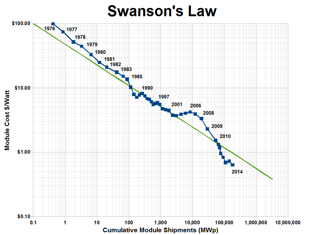
I've been reading science news, and I noticed that photovoltaic systems are rapidly becoming cheaper, and new PV solar power plants are constantly being built all over the world. This seems to be mostly the effect of pure economics - solar power is becoming competitive with coal/gas in many areas - than from governmental incentives or environmental considerations. From Wikipedia, we have a plot of PV cost vs year, showing a "Moore's Law"-type decrease every year, which is apparently called "Swanson's Law":

Case Study: Hawaii
Let's look a little closer at Hawaii, where expensive diesel-powered electricity and sunny days combine to make this electricity market a low hanging fruit for solar power. With 12% of all homes outfitted with PV, and solar power accounting for 4% of all electricity in 2013 by my estimate (including power produced and used by the same house, not just what goes over the grid), what's happening in Hawaii can help us understand what will happen with global PV.

I'm not sure who tried to make that green line fit with the blue data but it doesn't look like a good fit. It seems like the cost is decreasing even faster than the original estimate of being cut in half every ten years. So how has that affected the total installed solar power capacity?
You can see that installed PV capacity, as a share of global electricity capacity, is increasing exponentially for now (sigmoidally once it has a significant percentage). My (very) simple and optimistic model predicts that half of all global electricity will be solar power by 2025. Ten years is a very short amount of time to go from less than 1% to more than 50%, so I would take this prediction with a big grain of salt. Some reasons why this model may be way off:
- People are installing PV in the sunniest places with the highest energy costs, basically going after the lowest-hanging fruit. Once those places are saturated with PV, it'll be harder to convince people in cloudier places and with abundant fossil fuels to start investing in solar power. I'm sure there's an economic model of this phenomenon somewhere, but for now I'll defer to this headache-inducing technology adoption curve, which shows how disruptive technologies like electricity, refrigerators, clothes washers, autos, ACs, and internets are adopted over time. The main difference between these appliances/services and solar power is, anyone can install a few solar panels and sell electricity to their neighbors, but you can't easily opt-out of using solar electricity if your neighbor or utility company is providing that.
- Economies of scale get tricky here. On the one hand, as we study this system and build more of these things, we get better and more efficient at doing it, making the process cheaper per panel. On the other hand, building a lot of these panels will start to impact the availability of raw materials necessary for them, like tellurium (required for a certain type of PV) or lithium (required to store the energy from PV until people want to use it).
- Sunlight only shines during the day, and more in the summer than the winter. So once a certain area has enough PV to provide all daytime electricity demand, it won't be very useful to add any more PV unless there's some way to store that energy (like with batteries).
- There's a large up-front cost for making changes, like shifting from coal to solar power. Your state might save $20M per year by building a solar power plant, but if you don't have the $100M to build it, and you do still have a fully operational coal power plant, then which one are you going to use?
- One huge source of carbon emissions that isn't included in the above chart is transportation fuels, primarily oil. Once electric cars have a comparable range to combustion cars, then cheap solar electricity may cause a widespread shift to electric vehicles. This might increase demand, but would also allow for that demand to be more flexible: You plug your car in when you arrive home, and you tell its nightrider-style computer, "buy electricity whenever it's cheapest, but make sure I have at least 50 miles of range by tomorrow morning". All the cars in your area will be doing the same thing, so when demand spikes or supply drops, they'll all pause, but when supply spikes or demand drops, they'll all start slurping those precious Amps. This will serve to help demand adapt to fit supply, keep the prices relatively steady, and keep electricity availability more stable. On top of that, those cars might further be programmed to "buy low and sell high", automatically selling energy back to the grid when it's expensive, earning their owners a few extra dollars a month, and further contorting electricity demand to more closely fit supply.
- My sigmoidal model assumes that, eventually, all electricity will be made with solar power, but that's clearly not going to happen. For many cities and countries, it won't make sense to shut down their perfectly-good coal/nuclear/whatever plant until it breaks down. So I recalculated my fit to assume that solar power will only ever hit 60% of global electricity production, and the prediction is only delayed by three years: half of all electricity will be solar power by 2028. A quick note on the math here: since, as you can see in the semilog plot above, electricity has not left the "exponential" phase of the sigmoid shape - in other words, because it's so early and it only accounts for 0.9% of global supply - it's hard to predict where it will level off. I can get my model to fit with a correlation coefficient of 0.99 with a predicted maximum PV saturation as low as 3% of global supply. But we will know the answers within the next 5-10 years.
Case Study: Hawaii
Let's look a little closer at Hawaii, where expensive diesel-powered electricity and sunny days combine to make this electricity market a low hanging fruit for solar power. With 12% of all homes outfitted with PV, and solar power accounting for 4% of all electricity in 2013 by my estimate (including power produced and used by the same house, not just what goes over the grid), what's happening in Hawaii can help us understand what will happen with global PV.
The higher slope shows that Hawaii has more quickly adopted solar, because of all the factors which make solar so attractive there. (Data was hard to find here, so my data for 2012 and 2013 assumes that total power produced stayed the same as it was in 2011). My model suggests that solar should account for half of all power produced in Hawaii by 2018, which is breathtakingly sudden - but that model doesn't know about the bad news. There's been a big controversy about solar power on the islands, with the utility companies slowing down permits for residential installations, citing safety (the transmission lines, which were originally designed simply to deliver power from a few big sources to many small consumers, can't handle all the excess solar power generated during the day) while critics accuse the companies of protecting their own interests at the expense of residents. This has led to some people seceding from the grid, installing batteries to store their excess daytime energy for nighttime use. This is a taste of the barriers the rest of us will face in a few years, when local solar power production starts becoming significant. Can this be solved by simply installing a more robust power grid? Does each household need to buy a huge battery to help smooth out demand?
Regardless of these barriers, I'm still very excited about the near future of solar power.


